This is a master post for all the things concerning Color Management that I have found and learned. I'll put the intro material first, then the stuff relating to Painter and Unreal Engine, and put all the miscellaneous info at the bottom.
FIRST! What is Color Management? Color Spaces?
Basically, a 'color space' is what dictates what color the RBG values will be. The input RGB values are 'translated' by the Color Space to the output RGB values. They are necessary because there are many different types of screens (standard HD, Apple screens, IMAX, etc.), and they all display colors uniquely. Then there's also the factor of non-linear vs. linear color, and that can get complicated too.
What Are Color Spaces video - this is a baby video that is a quick overview of Color Spaces. There is a deeper 'Part 2' that explains color management more broadly (it assumes you have no prior knowledge and want to know the more technical details.) here: Longer Color Management Video and another video detailing color spaces, specifically Color Spaces Explained - all from Video Tech Explained.
Color Management for Substance Painter and Unreal Engine 5
Color Spaces impact artists because when we create materials, we are usually creating them in Substance Painter. We are defining the values of our materials based on the color space that Substance is using. Once we export and take them over to Unreal, we are looking at those materials in the color space Unreal Engine is using.
by default, Substance is not using the same color space as UE. Substance uses a linear color space, while UE5 is using the ACES sRGB color space. This causes a very annoying disconnect that has to be fixed by either going back and tweaking the material in Painter or adding adjustment nodes in Unreal.
To solve this, we just need to make Substance look like Unreal. In older versions of Painter, you had to find and download the ACES Lut and install it and adjust a bunch of settings - all things that are explained in this ACES for Painter video from William Faucher. I would recommend watching this video anyway, just because he explains why we do this. Also, fair warning, there is no way to get a perfect 1:1 for Painter and Unreal. We can get super close, but in the end, both programs use different rendering software, so there are some differences. Faucher demonstrates the differences in the video.
In the newer versions of Painter, it is quite easy to change the color spaces. There is no downloading or installation of anything required. All you need to do is go to Edit>Project Configuration and scroll to the Color Management dropdown.
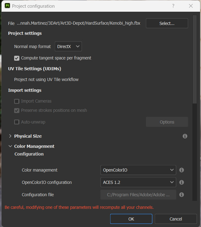
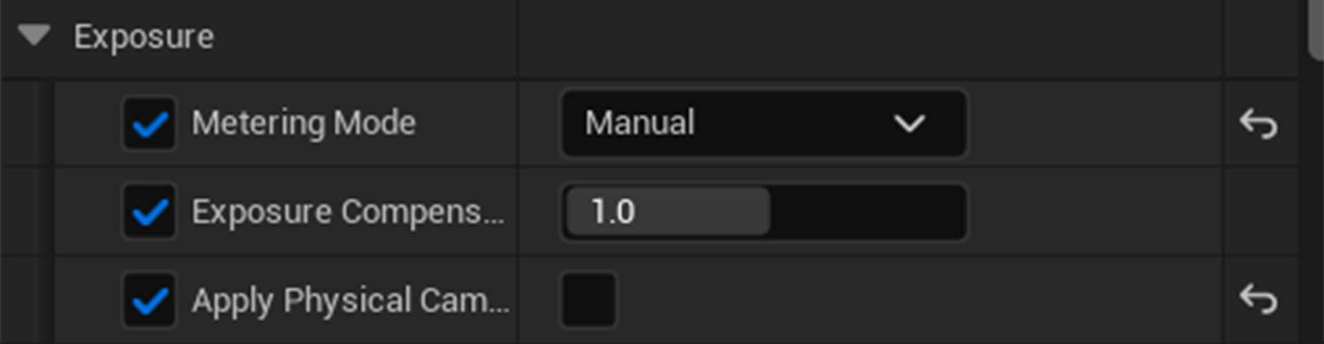
Color Management should be set to OpenColorIO, and OpenColorIO configuration should be set to ACES 1.2.
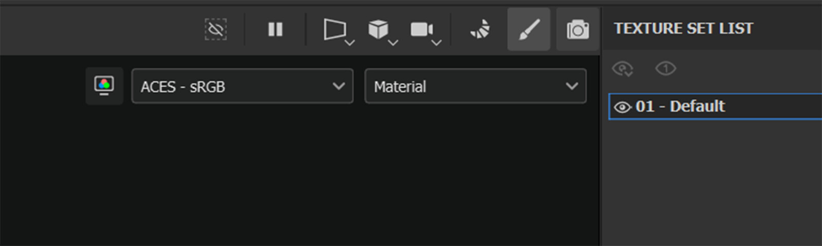
And there! In your viewport, there should be two dropdown taps in the upper right corner. The left dropdown selects your color space. For a material going to UE5, this dropdown should say ACES - sRGB.
This should be enough for your materials to be accurate when taking them to Unreal Engine.
Look Development Light Rigs with HDRI Backdrops
There is a further step that you can take to be sure that your materials will show in Unreal accurately, and that is to create a Look Dev Light Rig. A look dev light rig is a level/scene that is set up for neutral lighting to test your model and materials in engine. You can have multiple rigs - a neutral one and any additional rigs for more dramatic lighting. You leave the rig alone while you import your assets to see how they look. These rigs can also be used to display your assets for your portfolio or to show off.
(For my capstone, I'd like to create a neutral rig and then some super blue-tinted rigs - to replicate underwater lighting - so that I know what my assets will look like before I go through the process of finalizing an asset for the game.)
I am more familiar with Light Rigs in animation projects, so there might be another way to do this for games, but they should work about the same way. In the William Faucher video above, Faucher uses HDRIs to create a 1:1 comparison between Painter and Unreal. He takes an HDRI and uses it as the environment in Painter and creates a level in Unreal with ONLY an HDRI backdrop with the same HDRI map.
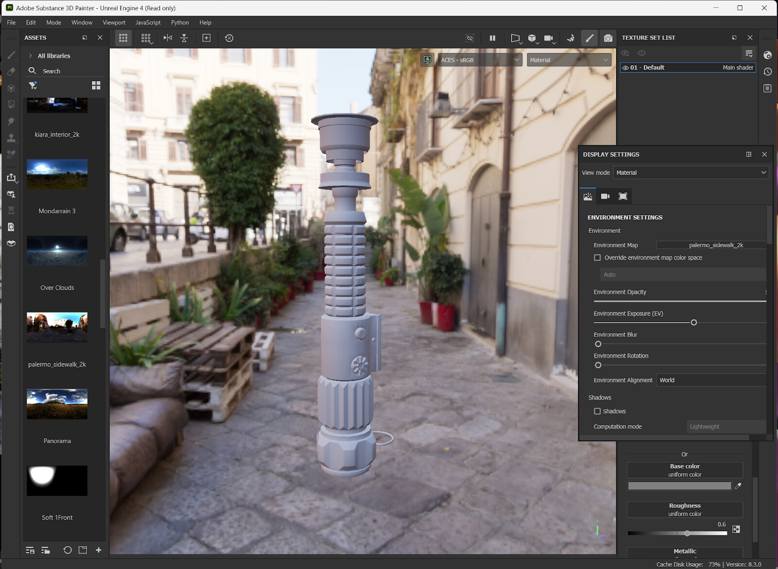
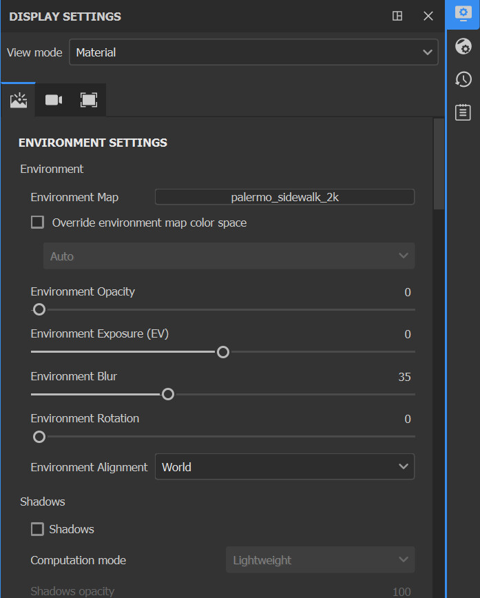
For example, here in Painter I am using the "Palermo sidewalk" HDRI as my Environment Map and a neutral gray material on my model.
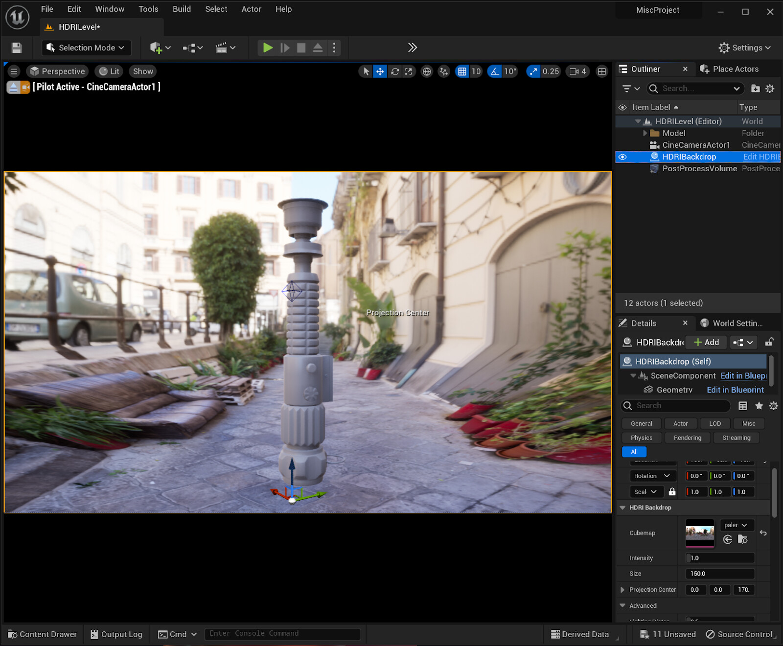
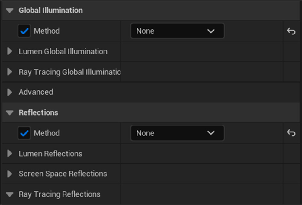
In Unreal, I have the same "Palermo Sidewalk" HDRI on my HDRI Backdrop with the same neutral gray material on my model. I also have a Post Process volume in the level. (I have the volume to control my exposure and to turn off any global illumination.)
With these settings and some minor adjustments to the 'Environment Exposure' setting in Painter, my viewports look almost the same. (The range I've found for the Environment Exposure(EV) setting is between -1 to 1. You should adjust this exposure so that the lighting matches as close as possible to the exposure in the Unreal scene.)
This is great because now, when I create any material in Painter, I know what it should look like in Unreal Engine.
When texturing for your next project, I'd recommend having an HDRI that has a similar look and feel to your game so that the materials you create will look like they belong in the level. My current capstone is very blue, for example, so I need to find a blue-tinted HDRI to use in Substance Painter. There is also the possibility of creating an HDRI out of your level in Unreal Engine, which I might have to try.
Other Things Concerning Color
Color Grading - more useful in film and animation, but this can be useful for creating a certain look and feel for your games. Some of these videos cover it in Davinci Resolve, but there are similar settings in the post Process Volume in Unreal Engine. Also could be useful if you want to do a cinematic or something.
Color Grading Tips - There are some tidbits I like in this one.
Color for Games: A GDC Talk - super cool talk about color grading games!
Color in Video Games - I really like this video for color design in games specifically. Color is very important for visual storytelling.